SERVICES
YEAR
CLIENT
INDEX

Ruslana is a Spanish-Ukrainian singer and songwriter who rose to prominence after placing third in the 2023 edition of Operación Triunfo. After the competition, she began shaping her identity as a solo artist, gravitating towards a blend of pop rock and electronic sounds, drawing inspiration from artists such as Avril Lavigne, Olivia Rodrigo and Måneskin.
In 2024, I was commissioned by Universal Music Spain to develop her logo and visual identity ahead of her debut album, GÉNESIS. The challenge was to translate her musical direction into a distinctive visual language with strong personality and commercial appeal for a teenage audience.
Once we established the visual identity for Ruslana, I took charge of the creative direction and design of her album artwork and packaging, building a cohesive visual world that would later extend into the stage and lighting design of her live performances. The final stage of the project involved developing the key art for her tour in support of the album.
MOODBOARD


After exploring a wide range of wordmark styles and lettering references, I turned to graffiti for inspiration, developing a distinctive logo that captured Ruslana's personality and artistic direction. The result was custom lettering that maintained some characteristic shapes and strokes of graffiti lettering. The composition was designed to feel playful, defiant, and organic without compromising its legibility.
A lettermark was later developed as a standalone symbol, making a direct reference to the anarchy sign. Using the same lettering and style from the wordmark to maintain visual consistency in both designs.
MAIN LOGOTYPE


SECONDARY WORDMARK
Bootzy TM was selected as a complementary typeface, offering a simpler and more brutalist contrast to the graffiti lettering. Its raw aesthetic was a great contrast and balance between the rock and electronic influences she was exploring for the album.
A customized version of her name in this style was also developed as a secondary wordmark, providing a more subtle alternative that could be used interchangeably with the primary logo depending on the composition.
FONT WORDMARK
SCRIBBLES


SKETCH TIMELAPSE
MERCHANDISING
The logo and lettermark were later adapted by Universal Music Spain’s in house team to develop merchandise for her live shows and online store.


BEFORE
AFTER
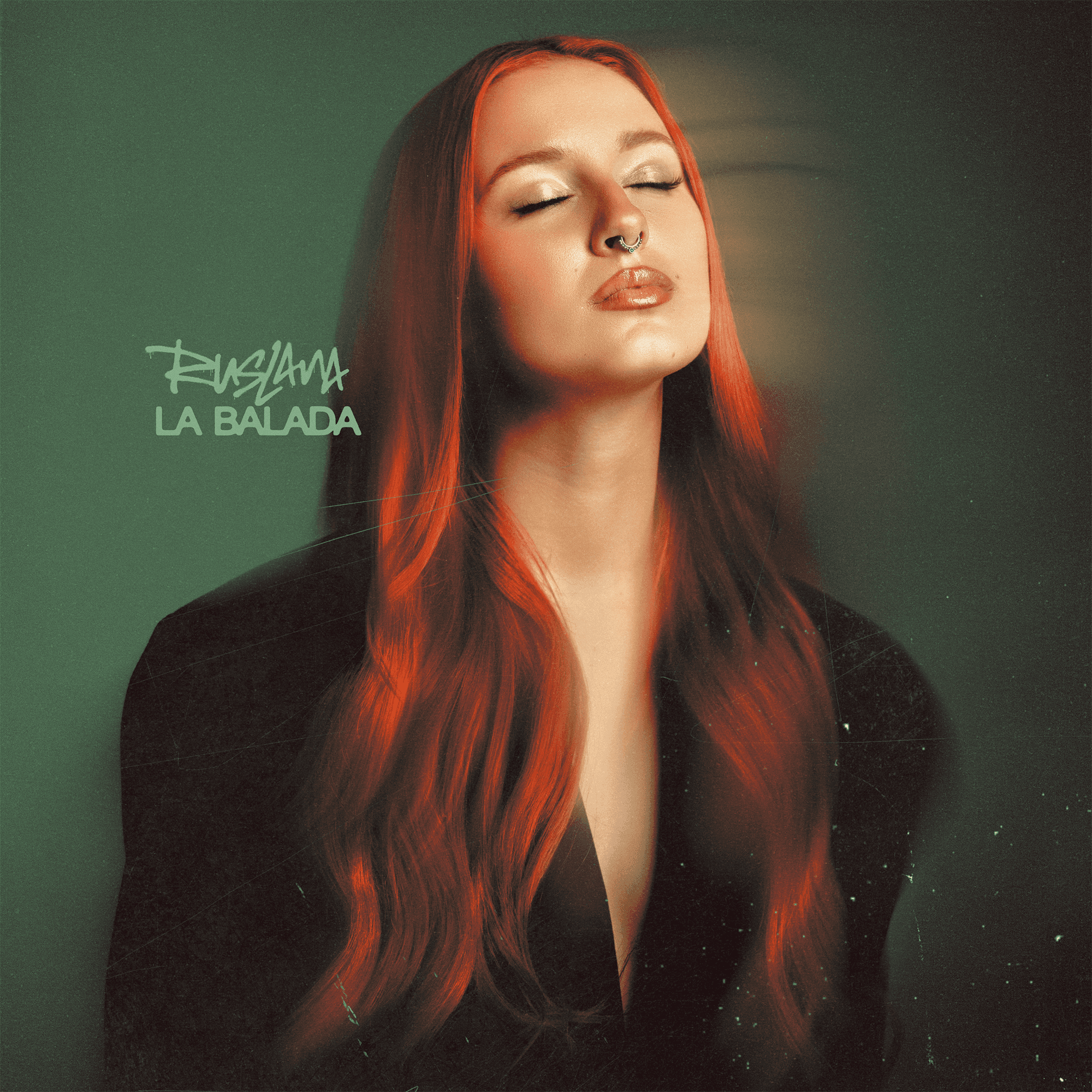
Building on the visual identity, I led the art direction for GÉNESIS, translating Ruslana's sound into a cohesive visual world. The album's musical influences and sonic contrasts directly informed the artwork's color palette, with red representing its pop rock influences and green reflecting its electronic side.
The artwork's concept explored the tension of a young artist breaking free from the image and narratives placed on her during her early rise to fame. To capture this idea, we portrayed Ruslana inside of a shattered glass box surrounded by musical equipment in flames. This visual symbolized the pressure building within her and the moment she would finally break free from all expectations to become her own artist.


TOUR KEY ART
Following the successful release of her debut album, I was tasked with creating the key art and different adaptations for Ruslana’s first nationwide solo tour.
The poster builds on album artwork’s central concept, depicting Ruslana finally breaking free from the glass box, with shattered shards flying towards the viewer. The green color was chosen to complement the warm tones of the hero image, maintaining the visual cohesion with the album’s color palette.


THE SINGLES